
Each SeasonalTrader module includes access to our proprietary Seasonal Charts. These charts are packed with information.
Here we will give a brief overview of how to use the charts and what their basic meaning is. There is a separate section of the Help resources that is dedicated exclusively to understanding the Seasonal Charts in depth.
First, let's look at a sample Seasonal Chart. Here is a chart of the March Australian Dollar futures contract. The chart shows an aggregated trend covering the years of 1987 to 2008.
First of all, let's clarify exactly what this chart is telling us. This explanation will get a little bit technical but we will try to keep the technical details to a bare minimum for this quick start guide. If the next few paragraphs prove to be a little more than you feel need to know, feel free to gloss over them.
To create this chart we took all of the March Australian Dollar futures contracts from 1987 to 2008. We then take the weekly closes of each contract and line them all up. We start from the end of contract and work backwards. Week 1 is the last week prior to first notice day. Week 2 is the week before Week 1. Week 3 is the week before Week 2, etc.
For each year we normalize the data so that it ranges between 0 and 100. This assures that all years are weighted equally rather than recent years getting more weight than earlier years just because the recent prices are higher. Again, we're trying to get at the average trend over the history of the contract. Normalizing the data is critical step.
Once all of the contracts histories are normalized then we can start calculating the average gain or loss for each week. We start with the closing (normalized) price for the oldest week on the chart. The above chart covers 22 weeks so the oldest week is Week 22. In the above chart the value of Week 22 appears to be about 18.
To calculate the value for Week 21 (the next point on the chart) we calculate the average gain/loss of Week 21 relative to the prior week (Week 22). In the above chart it appears that the value for Week 21 is approximately 12. That means that the average difference between Week 21 and Week 22 was -6.
What does this value of -6 mean? It means that over the final 22 weeks of the March Australian Dollar, the value of the March Australian Dollar has moved down 6% within the context of the average trend. It's important to understand that this does NOT mean that the Australian Dollar moves down 6% on average for the week. It just means that relative to the min and max of the average trend, it moved down 6%.
Now that we have a basic understanding of how the charts were created, we can summarize the main features of charts.
| Feature | Description |
|---|---|
| Trend Line | The trend line is telling us how the trend progresses each week, on average, relative to the average min and the average max of the trend. As described above, a change from one week to the next of -6 indicates that on average the price drops 6% of the total average trend. Note that the color of the trend line corresponds to the plus and minus signs for each week that you see near the bottom of the chart. More on those below. |
| Arrows | Immediately below the trend line are a collection of up and down arrows (though in the above they are all up). The green up arrows indicate weeks where the on average, the weekly gain/loss was in fact a gain 60% of the time or more over the available history. Red down arrows indicate that the weekly gain/loss was in fact a loss 60% of the time or more over the available history. |
| Plus / Minus | Each week of the chart has an associated green plus or red minus sign. A green plus sign indicates that over the available history, more of the weeks had gains than losses. A red minus sign indicates the opposite. |
| Weekly Values | Just below the plus / minus signs is a value for each week between zero and 100. If the value is green and below a plus sign then it indicates the percentage of weeks that were winning weeks. Red values indicate the percentage of weeks that were losing weeks. Note that it is those weeks where this value exceeds 60 (up or down) that also have an up or down arrow associated with them. |
| Calendar | Finally, at the bottom of each chart is a calendar. The calendar overlay is updated each year. That is, we take the average trend and line it up with the current year calendar. |
Navigating through the available charts is straightforward. Here, for example, are the controls for the US Futures Seasonal Charts:
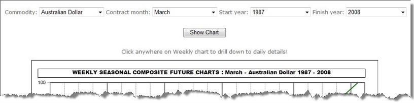
Each control is detailed below (the controls for Spreads and Stocks are similar).
| Name | Description |
|---|---|
| Commodity | The commodity drop down menu allows you to choose from any of the available commodities from the US Futures module. |
| Contract Month | Here you can choose the contract month that you want to see a chart for. Note that it is advised that you use the chart for the specific contract month that you intend to trade. |
| Start Year | You can vary the amount of history that you include in creating the average trend. Start Year defaults to the earliest available year of history for the given contract. |
| Finish Year | Like Start Year, the Finish Year drop down allows you to vary the last year that is taken into consideration in creating the average trend. It defaults to the most recently available year. |
| Show Chart | Once you've made all of the above selections, click on Show Chart to pull up the new chart. |
Clicking on any part of the Weekly Seasonal Chart will bring up a new chart that represents a "drill down" into the daily level of trend. Daily Seasonal Charts are primarily of interest to shorter term traders.
For those that want to understand the Seasonal Charts in even greater detail, you can visit the Seasonal Charts In Depth section of this help center.